Posts

Posts uit augustus, 2020 tonen

Roundism - 08-09-16

Afbeelding
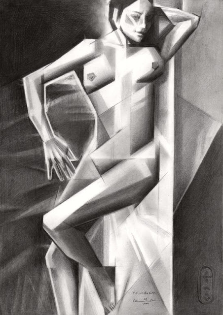
  Roundism - 08-09-16  Part of the 18 Variations of the same theme. This one I drew after the last one I did already was a year ago. Somehow I did not felt the series was finished yet. I did two oils on the theme: Roundism - 06-07-16 and Roundism - 12-02-17.  I sold it quickly and this roundism variation was a cornerstone for many to come. I like doing these roundish forms that remind me to Tamara de Lempicka's volumnous body scapes for a very long time. For some reason this one turned out to look rather art deco . It is an artistic era gone by that I love very much. I often wonder why such eras do not come to pass nowadays. I feel that some kind of new movement in art is yearning but I cannot see the dawn of it yet. We are stuck in postmodernism, concept art and all things unaesthetic. Perhaps I did this art work to evoke some movement? Maybe you can tell... If you want to read futher on this topic, please visit my website . If you want to buy a printable (hi-res picture...
Golden brown – 24-08-20

Afbeelding
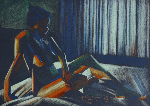
  Golden brown – 24-08-20 I wanted to test some new paper I bought at Brugman Art , Voorburg, Netherlands, which is Talens Toned Colour Paper. What motif to use? Right, my regular model that shows great skin hues. Almost like Golden Brown, reminding to The Stranglers' song. I also happen to have Cretacolor pastel stick (gold) that I always wanted to try out but never found use for. I must say that both the gold stick as the paper suited to my needs. I kept a lot of the paper open so both the negative space (background) and the positive space (model) could communicate. The orange and yellow are saturated whereas the whites, light and dark blues serve as counterbalances to the saturation. There were some great angels she showed and I especially like the way the elbow is stretched, a feature only women can show in that particular fashion. If you want to read further you can visit my website here . If you like to buy a printable (hi-res picture that you can print and frame), please cli...

Roundism – 19-08-20

Afbeelding
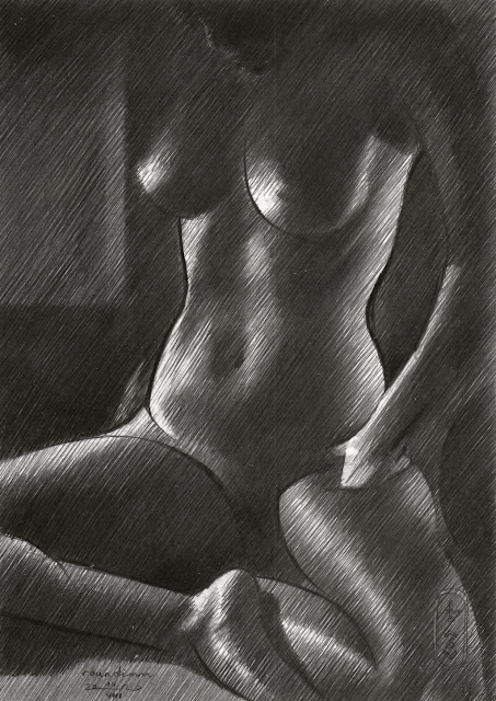
    Roundism – 19-08-20 Once per month I pick up my model at her house and drive to mine where we have a session. I shoot photos of either premeditated poses I let her pose or just freewheel and let her move in all her female ways. This pose was a spontaneous one while she was reclining at my folding guest bed. If I am lucky I have time left to do a live drawing sessing. Models are way to expensive nowadays to only draw them and not take a whole lot of reference pictures for a rainy day. The drawing is a continuation of the Roundism series I started 6 years ago but it evolved over time and the latest addition to the mix is the element of solarization . It became famous by the photos of Man Ray who put it on the surrealist menu. I did render the body cubistic while I did the folds of the blankets solarized. This way the arm does not 'float'. Perhaps I will do more in the future. What do you think? Click here to read further on my website . Click here to buy a printable of this...

Nude 12 (2013)

Afbeelding
    Nude 12 (2013) This drawing hangs at Brugman Art , Voorburg, Netherlands and was specially made to be displayed there so students can see what I am up to. I made quite some realistic / impressionistic looking nudes throughout the years in this hachted strokes style, which enables me to make much more subtle tonal gradients than I could ever made blending areas into one another. Blending (f.e. by feathering with your fingers or a stump) to my opinion makes colors seem sluggish or filthy quite easily. I prefer keeping my colors clean and whenever I want to have colors blend in one another I do that by hatching strokes of f.e. complemenetary colors next to eachother, quiter after the fashion of divisionism . Two colors can optically get the desired greyish effect and is more pleasant to the eye than to actually make grey / unsaturated colors by the bleding process. Voila, just an insight. Obviously in this pastel I did not employ colours but you get an idea of how I work and ...

Frida Kahlo (2020)

Afbeelding
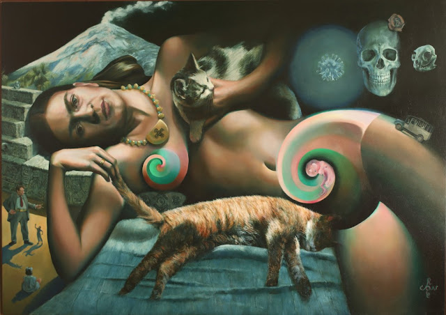
    Frida Kahlo (2020) There should have been a Frida Kahlo year here in The Netherlands. The Drents Museum was to organize this 'Viva la Frida!' exhibition but now it is postponed until Fall 2021. This event however inspired me to make this painting. I made a previous drawing 'Sans titre - 11-10-18' and the challenge in this oil was to scale it up from A4 to 85 x 120 cm and tell more. What to tell then? I decided to focus on her love for communism, Diego Rivera and the Aztecs. Three controversial topics that ruled her life, next to the initial tragedy, being the bus accident. Frida never backed away from controversy and so did not I. I mean, I love Frida, although her paintings sometimes are a little bit wonky as to techniques whereas others are simply fantastic. The latter keep prying in. your eyes. I often tell my students that it is prefereable to talk about an artist's idea rather than his / her techniques. Frida made up for ideas in abudance. I used the colo...

Roundism - 14-08-20

Afbeelding
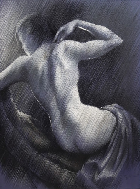
  Roundism – 07-08-20  Once in a while you reach back and turn to older drawings you made in the past, like ' Roundism - 14-08-14 '. I liked the hatched strokes anew and since I hatch a lot, especially when the background is very dark, sometimes I do now rub it to an even shine but leave the hatched strokes like they are. That was my initial styles some years back. It was fun to execute a drawing in the same style once again. My model of Indian descendance has this crazy, lovely shine on her skin. In color such a darker skin is lovely to see. All kinds of colors that complement eachother. In a back-and-white situation there is still a lot to see though and often it is the limitation that makes a better art work. Hence this one. I hope you like it. Click here if you want to read further on my website . Click here if you want to download a printable for only € 3.99 .

Queen Maxima - 17-10-14

Afbeelding
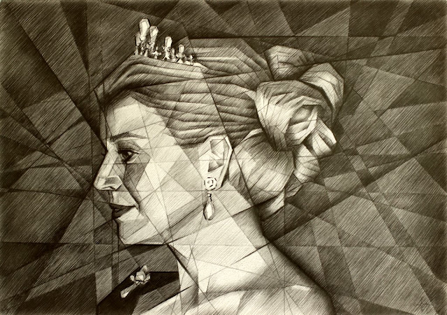
  Queen Maxima - 17-10-14  In 1999 the buzz in The Netherlands we were to have a samba princess, under the name 'Maxima' and 20 years later her groove catched on. She is more popular than any other royal member. besides her dancing capacities she is a kind tempered character and engaged. Not but not least she is a feast for the eye and that is why I like to capture her through the eyes of Erwin Olaf who took her picture on behalf of the Rijksvoorlichtingsdienst. Basically this is not the real deal 'cubism' but rather a kind of cubist styling I liked to do 6 years ago. The only thing I do is extrapolate all natural appearing plains into the negative space. Very effective though. If you like you can read further on my website here . If you like it even more you can download a printable (hi-res picture you can print and frame) here.

Nude - 17-06-15

Afbeelding
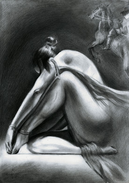
    Nude - 17-06-15 Sometimes you come across a picture that both enchants you and leave you clueless at the same time. For a long time I did not think I could not add value to the image, being the clairobscur lit photo of a ballerina. That is when I saw the connection between the nude woman and the horse so I decided to make them as one. I gladly make use of a quality only human beings seem to posses: to see patterns in everything by the force of association and inspiration. I wonder if horses can see ballerinas in the same species? I know I do and I am not even a horse. Click here if you want to read further on my website .  If  you like it, you can download a hi-res printable that you can frame as a poster. Only € 3.99