Nude 12 (2013)
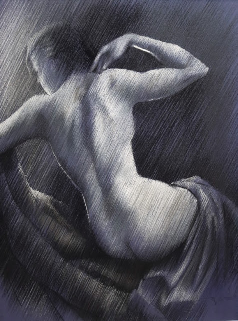
Nude 12 (2013) This drawing hangs at Brugman Art , Voorburg, Netherlands and was specially made to be displayed there so students can see what I am up to. I made quite some realistic / impressionistic looking nudes throughout the years in this hachted strokes style, which enables me to make much more subtle tonal gradients than I could ever made blending areas into one another. Blending (f.e. by feathering with your fingers or a stump) to my opinion makes colors seem sluggish or filthy quite easily. I prefer keeping my colors clean and whenever I want to have colors blend in one another I do that by hatching strokes of f.e. complemenetary colors next to eachother, quiter after the fashion of divisionism . Two colors can optically get the desired greyish effect and is more pleasant to the eye than to actually make grey / unsaturated colors by the bleding process. Voila, just an insight. Obviously in this pastel I did not employ colours but you get an idea of how I work and ...