Nude 12 (2013)
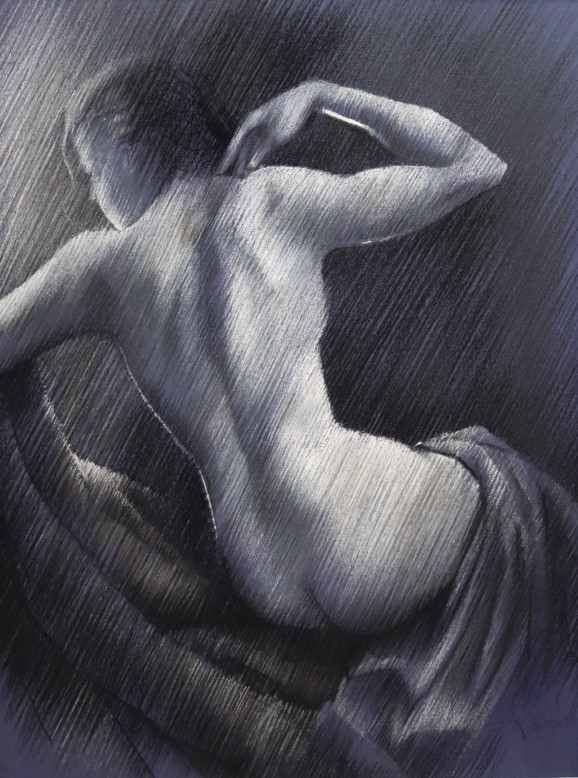
Nude 12 (2013)
This drawing hangs at Brugman Art, Voorburg, Netherlands and was specially made to be displayed there so students can see what I am up to. I made quite some realistic / impressionistic looking nudes throughout the years in this hachted strokes style, which enables me to make much more subtle tonal gradients than I could ever made blending areas into one another. Blending (f.e. by feathering with your fingers or a stump) to my opinion makes colors seem sluggish or filthy quite easily.
I prefer keeping my colors clean and whenever I want to have colors blend in one another I do that by hatching strokes of f.e. complemenetary colors next to eachother, quiter after the fashion of divisionism. Two colors can optically get the desired greyish effect and is more pleasant to the eye than to actually make grey / unsaturated colors by the bleding process.
Voila, just an insight. Obviously in this pastel I did not employ colours but you get an idea of how I work and think.
If you like it, you can download a printbale (hi-res picture you can print and frame).


Reacties
Een reactie posten